Hey Natalie, I like your posters 4 and 7. Four is visually appealing because of the design that is created through the plant, which is also fitting the "grown", aspect of your poster, however, play with some color, it could use a nice pop. Seven has that pop, where you used those colors, play with different fonts for this one, the one you currently have feels like its not fitting very well. I know I have no room to talk, because I still have to play with fonts as well.
I really like the colors and simplicity of 8, but it doesn't make me want to eat locally grown. There is no pain you are trying to fix. The colors are very appropriate to the subject.The roots do give me the feeling of going back to the roots of how things used to work, but not everyone is going to pick up on that. AND WHAT IS CSA???
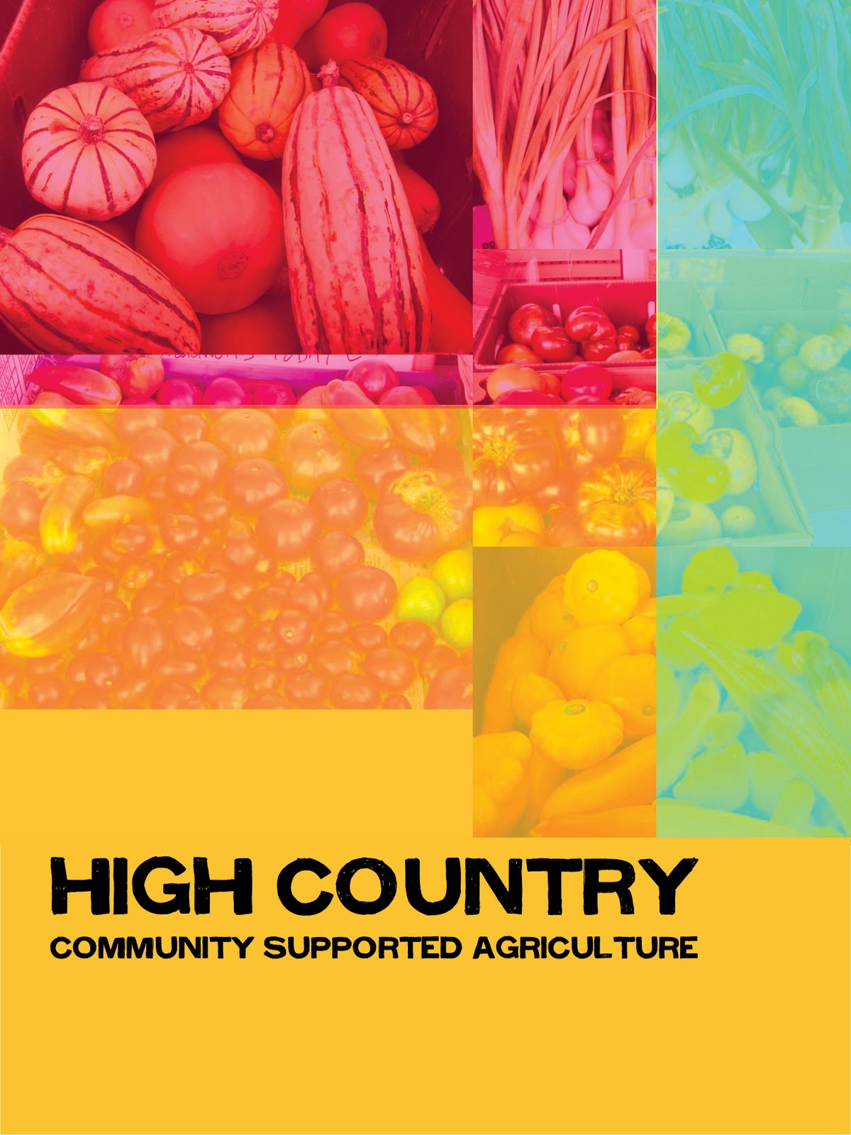
7 is my favorite. The root idea on 8 is really good too. The color choices on number 7 really catch my eye. In 8, I feel that the color scheme fits the imagery, but it would not keep me attention as much as the color in 7.
I like the first, second and eighth poster designs. The first one is very clean and appealing. I like the way the text drops down the page in the second one and I like the root concept of the eighth one because it pushes the idea of natural foods within a poster design.
I am really liking what you've done with these! Especially the colors.
I also really like the second one, but only the type. I think that if you move around the images or even get something new to put in there, it would be more appealing. Right now it's a bit confusing, but I really like the list.
I also like number 7 and 8. The roots coming out of the letters give that aha! moment (for me, at least), especially since my aunt and uncle have a farm (it's just herbs, blueberries, and hops, but still).
Look at you with your bright colors! 5, 6, 7, and 8 are my favorites. I like that you used your root thing again in 8 like you did with some of your logos. I'm loving all the ones with the bright colors and the food, though, the most. It gets people excited and happy about farming.
I like the first and second one the best. In the second I think that including the LOCAL GROWN would give a better reading then COMMUNITY. But I feel the photograph of the different foods has a great play with the poster.
I really like the pattern that you have used in the first and second one. I think I like the application of the pattern better in the first one. I also really like the idea of the roots in number eight. I really really like the bright colors you used on number seven because they really capture my attention. I am wondering, though, if those colors are too "girly", they appeal to one crowd, while deterring another crowd.
I like the fourth poster the most right now, I like your background image and the color scheme that you have chosen to use. I get that natural feel from it. I would suggest you putting transparency text box some where so you can say something on your poster with out having to much conflict from the background.
I think you should be sure to incorporate something about eating locally in the poster, since the name of your organization does not inform the viewer as to what you do.
I like the idea in #8 where the words are growing, you could expand on this idea...the word could become the food even more.
#7 is bright and inviting and uses photographs of the food to entice the viewer to want to learn more about your group. It reflects the color scheme of a full course veggie meal!
I love the idea of designing using the plant life in 3 and 4, 4 especially. 8's simple approach works well too, but needs a little info to help the viewer know just who HCCSA is (more so for 4 I think). Some of the later ones look a little busy and muddled. Too much imagery going every which way and too much overlapping for my taste. The vibrant colors also kinda hurt my eyes, I prefer the schemes you used for 2, 4, and 8. Very plant-like.
Though the colors may seem bland, the first 3 conveys key messages. Eat local could be the big idea for the campaign --interpreting locally grown. #3 is informational -- decide if this is what they need vs a poster that promotes CSA. Many are nicely developed from a formal and info. perspective but many need to say more.


Hey Natalie,
ReplyDeleteI like your posters 4 and 7. Four is visually appealing because of the design that is created through the plant, which is also fitting the "grown", aspect of your poster, however, play with some color, it could use a nice pop. Seven has that pop, where you used those colors, play with different fonts for this one, the one you currently have feels like its not fitting very well. I know I have no room to talk, because I still have to play with fonts as well.
I really like the colors and simplicity of 8, but it doesn't make me want to eat locally grown. There is no pain you are trying to fix. The colors are very appropriate to the subject.The roots do give me the feeling of going back to the roots of how things used to work, but not everyone is going to pick up on that. AND WHAT IS CSA???
ReplyDelete7 is my favorite. The root idea on 8 is really good too. The color choices on number 7 really catch my eye. In 8, I feel that the color scheme fits the imagery, but it would not keep me attention as much as the color in 7.
ReplyDelete... sincerely...
I like the first, second and eighth poster designs. The first one is very clean and appealing. I like the way the text drops down the page in the second one and I like the root concept of the eighth one because it pushes the idea of natural foods within a poster design.
ReplyDeleteI am really liking what you've done with these! Especially the colors.
ReplyDeleteI also really like the second one, but only the type. I think that if you move around the images or even get something new to put in there, it would be more appealing. Right now it's a bit confusing, but I really like the list.
I also like number 7 and 8. The roots coming out of the letters give that aha! moment (for me, at least), especially since my aunt and uncle have a farm (it's just herbs, blueberries, and hops, but still).
And 7, I'm just a sucker for those colors.
Look at you with your bright colors! 5, 6, 7, and 8 are my favorites. I like that you used your root thing again in 8 like you did with some of your logos. I'm loving all the ones with the bright colors and the food, though, the most. It gets people excited and happy about farming.
ReplyDeleteI like the first and second one the best. In the second I think that including the LOCAL GROWN would give a better reading then COMMUNITY. But I feel the photograph of the different foods has a great play with the poster.
ReplyDeleteI really like the pattern that you have used in the first and second one. I think I like the application of the pattern better in the first one. I also really like the idea of the roots in number eight. I really really like the bright colors you used on number seven because they really capture my attention. I am wondering, though, if those colors are too "girly", they appeal to one crowd, while deterring another crowd.
ReplyDeleteI like the fourth poster the most right now, I like your background image and the color scheme that you have chosen to use. I get that natural feel from it. I would suggest you putting transparency text box some where so you can say something on your poster with out having to much conflict from the background.
ReplyDeleteI think you should be sure to incorporate something about eating locally in the poster, since the name of your organization does not inform the viewer as to what you do.
ReplyDeleteI like the idea in #8 where the words are growing, you could expand on this idea...the word could become the food even more.
#7 is bright and inviting and uses photographs of the food to entice the viewer to want to learn more about your group. It reflects the color scheme of a full course veggie meal!
I love the idea of designing using the plant life in 3 and 4, 4 especially. 8's simple approach works well too, but needs a little info to help the viewer know just who HCCSA is (more so for 4 I think). Some of the later ones look a little busy and muddled. Too much imagery going every which way and too much overlapping for my taste. The vibrant colors also kinda hurt my eyes, I prefer the schemes you used for 2, 4, and 8. Very plant-like.
ReplyDeleteThough the colors may seem bland, the first 3 conveys key messages. Eat local could be the big idea for the campaign --interpreting locally grown. #3 is informational -- decide if this is what they need vs a poster that promotes CSA. Many are nicely developed from a formal and info. perspective but many need to say more.
ReplyDelete